28 基本R绘图
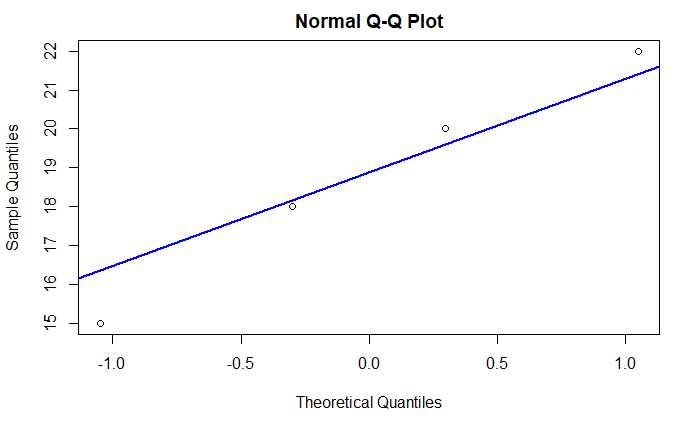
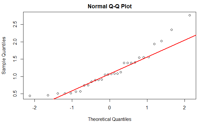
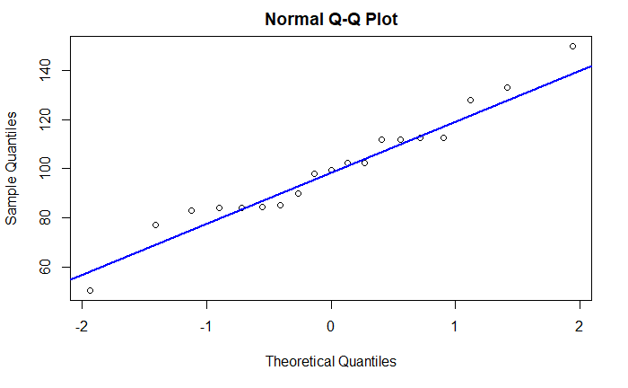
正态QQ图
用qqnorm和qqline作正态QQ图。 当变量样本来自正态分布总体时, 正态QQ图的散点近似在一条直线周围。
# 模拟正态分布随机数,并作正态QQ图:
qqnorm(x)
qqline(x, lwd=2, col="blue")
# 模拟对数正态数据,并作正态QQ图:
z <- 10^rnorm(30, mean = 0, sd=0.2)
qqnorm(z)
qqline(z, lwd=2, col="red")
# d.class的体重数据
qqnorm(d.class$weight)
qqline(d.class$weight, lwd=2, col="blue")
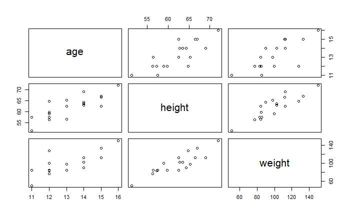
散点图
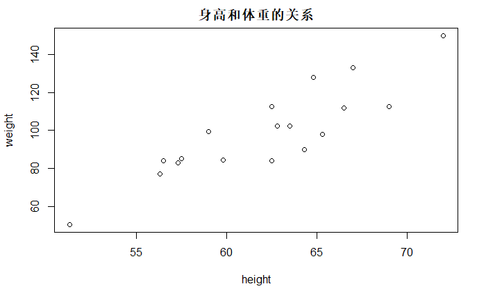
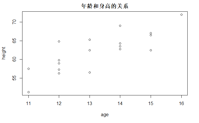
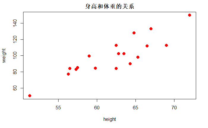
以d.class数据为例, 有name, sex, age, height, weight等变量。
# 体重对身高的散点图
plot(d.class$height,
     d.class$weight,
     xlab = "height",
     ylab = "weight",
     main = "身高和体重的关系")
plot(d.class$age, d.class$height,xlab = "age", ylab = "height",main = "年龄和身高的关系")
使用with函数简化数据框变量访问格式
with(d.class, plot(height,weight))
用pch参数指定不同散点形状,用col参数指定颜色, 用cex参数指定大小
# 体重对身高的散点图
plot(d.class$height,
     d.class$weight,
     xlab = "height",
     ylab = "weight",
     main = "身高和体重的关系",
     # 散点图形状
     pch = 20,
     # 颜色
     col="red",
     # 大小
     cex = 2)
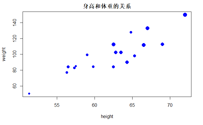
用气泡大小表现第三维(年龄):
with(d.class,
     plot(height, weight,
          xlab = "height",
          ylab = "weight",
          main = "身高和体重的关系",
          pch = 16,
          col = "blue",
          cex=1 + (age - min(age))/(max(age)-min(age))
          ))
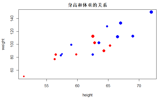
# 用气泡大小表现年龄, 用颜色区分性别
with(d.class,
     plot(height, weight,
          xlab = "height",
          ylab = "weight",
          main = "身高和体重的关系",
          pch = 16,
          col = ifelse(sex=="M", 'blue','red'),
          cex=1 + (age - min(age))/(max(age)-min(age))
          ))
# 用pairs()函数可以做散点图矩阵
pairs(d.class[, c("age", "height", "weight")])
曲线图
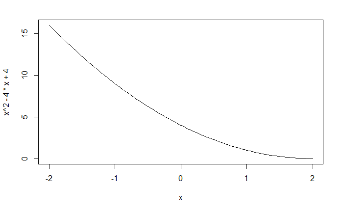
curve()函数接受一个函数, 或者一个以x为变量的表达式, 以及曲线的自变量的左、右端点, 绘制函数或者表达式的曲线图
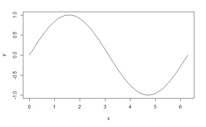
在plot函数中使用 type=’l’参数可以作曲线图,L
x <- seq(0, 2*pi, length = 200)
y <- sin(x)
plot(x,y, type='l')
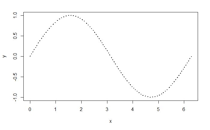
除了仍可以用main, xlab, ylab, col等参数外, 还可以用lwd指定线宽度, lty指定虚线,多条曲线
plot(x,y, type='l', lwd=2, lty=3)
多条曲线, 可以用matplot()函数。
x <- seq(0, 2*pi, length = 200)
y1 <- sin(x)
y2 <- cos(x)
matplot(x, cbind(y1,y2), type='l',
        lty=1,lwd=2, col=c('red','blue'),
        xlab = "x", ylab="y")
abline(h=0,col="pink")
三维图
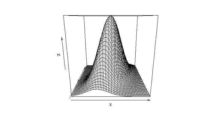
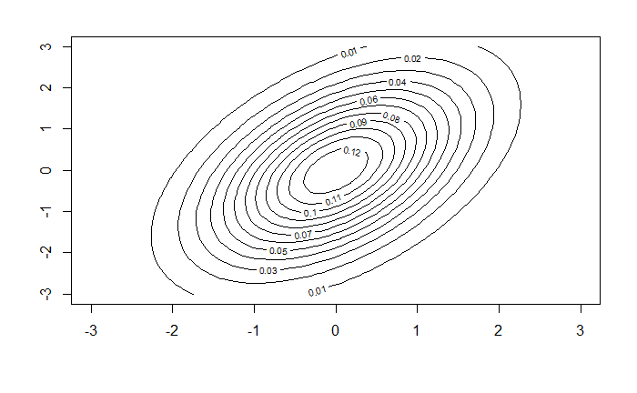
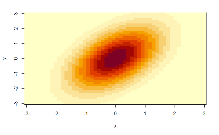
用persp函数作三维曲面图, contour作等值线图, image作色块图。 坐标x和y构成一张平面网格, 数据z是包含z坐标的矩阵,每行对应一个横坐标, 每列对应一个纵坐标。
生成二元正态分布密度曲面数据
x <- seq(-3,3, length = 50)
y <- x
f <- function(x,y, ssq1=1, ssq2=2, rho=0.5){
  det1 <- ssq1*ssq2*(1- rho^2)
  s1 <- sqrt(ssq1)
  s2 <- sqrt(ssq2)
  1/(2*pi*sqrt(det1)) * exp(-0.5 / det1 * (
  ssq2*x^2 + ssq1*y^2 - 2*rho*s1*s2*x*y))
}
z <- outer(x, y, f)
# 作二元正态密度函数的三维曲面图、等高线图、色块图
persp(x, y, z)
动态三维图
rgl包能制作动态的三维散点图与曲面图。
install.packages('rgl')
library(rgl)
iris数据框包含了3种鸢尾花的各50个样品的测量值, 测量值包括花萼长、宽, 花瓣长、宽。 用rgl的plot3d()作动态三维散点图如下:
with(iris, plot3d(
  Sepal.Length, Sepal.Width, Petal.Length,
  type="s", col=as.numeric(Species)))
生成一个网页形式的三维图,可以旋转。
用rgl的persp3d()函数作曲面图。 如 二元正态分布密度曲面
x <- seq(-3,3, length=100)
y <- x
f <- function(x,y,ssq1=1, ssq2=2, rho=0.5){
     det1 <- ssq1*ssq2*(1 - rho^2)
     s1 <- sqrt(ssq1)
     s2 <- sqrt(ssq2)
     1/(2*pi*sqrt(det1)) * exp(-0.5 / det1 * (
       ssq2*x^2 + ssq1*y^2 - 2*rho*s1*s2*x*y))
}
z <- outer(x, y, f)
persp3d(x=x, y=y, z=z, col='red')
生成一个网页形式的交互式曲面图
适当设置可以在R Markdown生成的HTML结果中动态显示三维图。
初级图形函数
abline()函数
用abline函数在图中增加直线。 可以指定截距和斜率, 或为竖线指定横坐标(用参数v), 为水平线指定纵坐标(用参数h)。 如
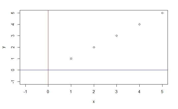
plot(1:5, 1:5, xlab = "x", ylab = "y", xlim = c(-1,5), ylim = c(-1,5))
# h and v can set a vector, sunch as h=c(1,2,3)这样既就能一次话多条直线
abline(h=0, v=0, col=c("blue", "red"))
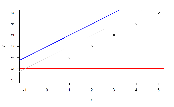
abline 函数添加斜线有两种用法:
第一种分别指定交点和斜率的值,参数 a 代表直线与y轴的交点距坐标原点的位置,参数 b 代表斜率,
plot(1:5, 1:5, xlab = "x", ylab = "y", xlim = c(-1,5), ylim = c(-1,5))
# h and v can set a vector, sunch as h=c(1,2,3)这样既就能一次话多条直线
abline(a=2, b=1, h=0, v=0, col=c("blue", "red"),lwd=2)
abline(a=1, b=1, col="grey",lty=2)
第二种通过一个长度为2的向量同时指定交点与原点的距离和斜率
plot(1:5, 1:5, xlab = "x", ylab = "y", xlim = c(-1,5), ylim = c(-1,5))
# h and v can set a vector, sunch as h=c(1,2,3)这样既就能一次话多条直线
abline(coef = c(2,1), h=0, v=0, col=c("blue", "red",lwd=2))
abline(coef = c(1,1), col="grey",lty=2)
线条的属性:
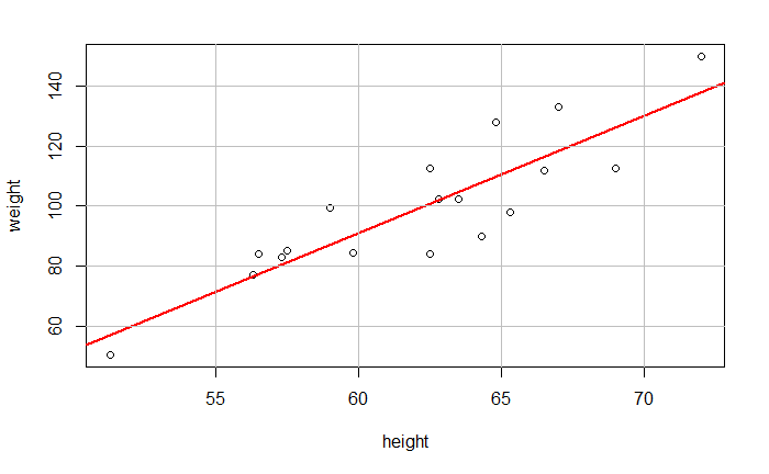
还可以添加一条回归线,比如计算两个坐标值之间的线性回归
# lm适应线性模型
acls <- lm(weight ~ height, data = d.class)
plot(d.class$height, d.class$weight, xlab = "height", ylab = "weight")
abline(acls, col = "red", lwd=2)
# 竖线
abline(v=c(55,60,65,70),col="gray")
# 水平线
abline(h=c(60,80,100,120,140),col="gray")
with(d.class, plot(height, weight))
abline(lm(weight ~ height, data = d.class), col="red", lwd=2)
abline(v=c(55,60,65,70), col="gray")
abline(h=c(60,80,100,120,140), col="gray")
lines()
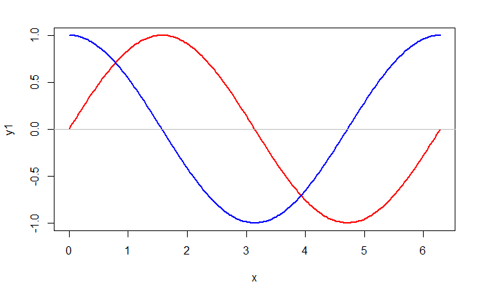
lines()函数增加曲线
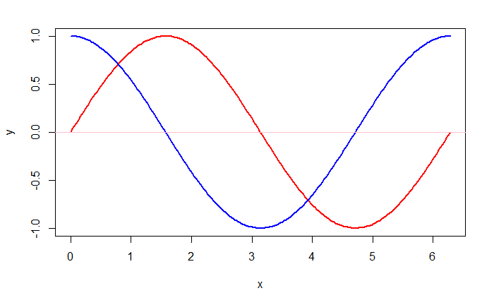
x <- seq(0, 2*pi, length=200)
y1 <- sin(x)
y2 <- cos(x)
plot(x, y1, type='l', lwd=2, col="red")
lines(x, y2, lwd=2, col="blue")
abline(h=0, col='gray')
图例
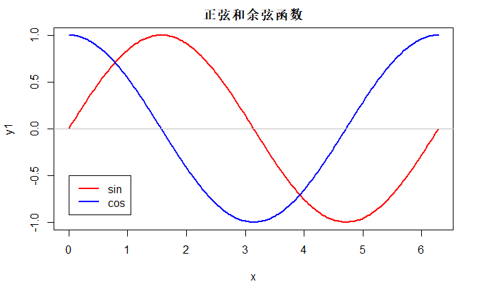
可以用legend函数增加标注
x <- seq(0, 2*pi, length=200)
y1 <- sin(x)
y2 <- cos(x)
plot(x, y1, type='l', lwd=2, col="red", main = "正弦和余弦函数")
lines(x, y2, lwd=2, col="blue")
abline(h=0, col='gray')
# 0,-0.5表示图例放的坐标
legend(0, -0.5, col=c("red", "blue"),
       lty=c(1,1), lwd=c(2,2),
       legend=c("sin", "cos"))
x <- seq(0, 2*pi, length=200)
y1 <- sin(x)
y2 <- cos(x)
plot(x, y1, type='l', lwd=2, col="red", main = "正弦和余弦函数")
lines(x, y2, lwd=2, col="blue")
abline(h=0, col='gray')
# 还可以将图例放在bottom,top, left, right等
legend('top', col=c("red", "blue"),
       lty=c(1,1), lwd=c(2,2),
       legend=c("sin", "cos"))
axis()
在plot()函数中用
axes=FALSE可以取消自动的坐标轴。
用box()函数画坐标边框。
用axis函数单独绘制坐标轴。
axis的第一个参数取1,2,3,4, 分别表示横轴、纵轴、上方和右方。 axis的参数at为 刻度线位置,labels为标签。
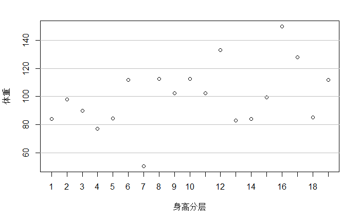
with(d.class, plot(seq(along=height), weight,
                   axes=F, xlab= "身高分层", ylab = "体重"))
box();axis(2)
# abline(lm(weight ~ height, data = d.class), col="red", lwd=2)
# abline(v=c(55,60,65,70), col="gray")
abline(h=c(60,80,100,120,140), col="gray")
axis(1, at=seq(19), labels= c(1:19))


 微信
微信 支付宝
支付宝